Underwriting Steps
When our underwriting interface became a bottleneck in helping businesses transition to employee ownership, we transformed a cluttered, desktop-only process into an intuitive, mobile-friendly experience that accelerated decision-making and reduced manual touch-points.
Company
Teamshares Inc.
Year
2023
Category
Product Design
Role
Lead designer
Overeview
Redesigning Teamshares' Underwriting Steps flow that transformed their business evaluation process. The underwriting process at Teamshares faced several critical user experience challenges that were impacting both efficiency and user satisfaction. Our research revealed that the existing interface was creating unnecessary cognitive load and operational friction for users.
The problem
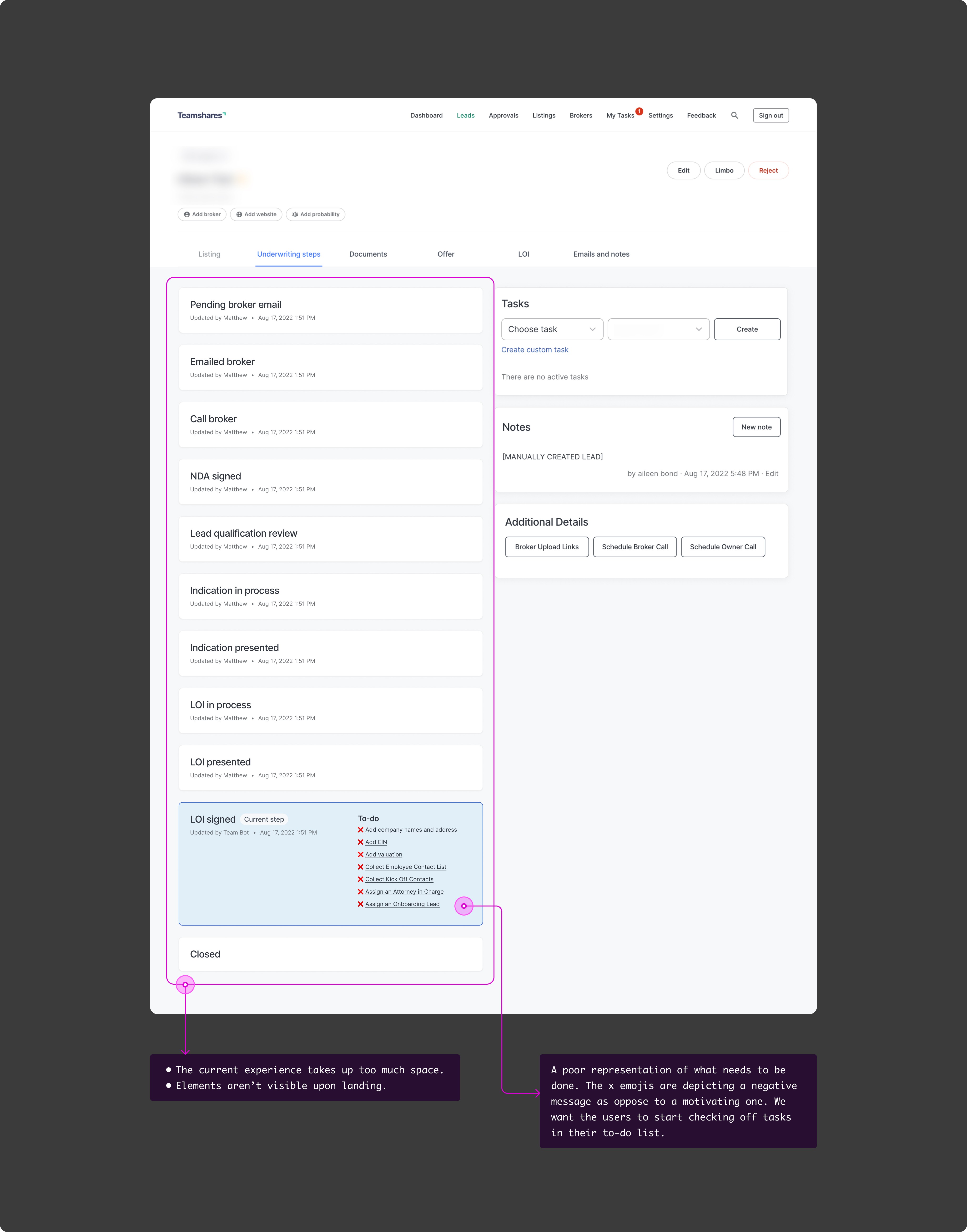
Pain points:
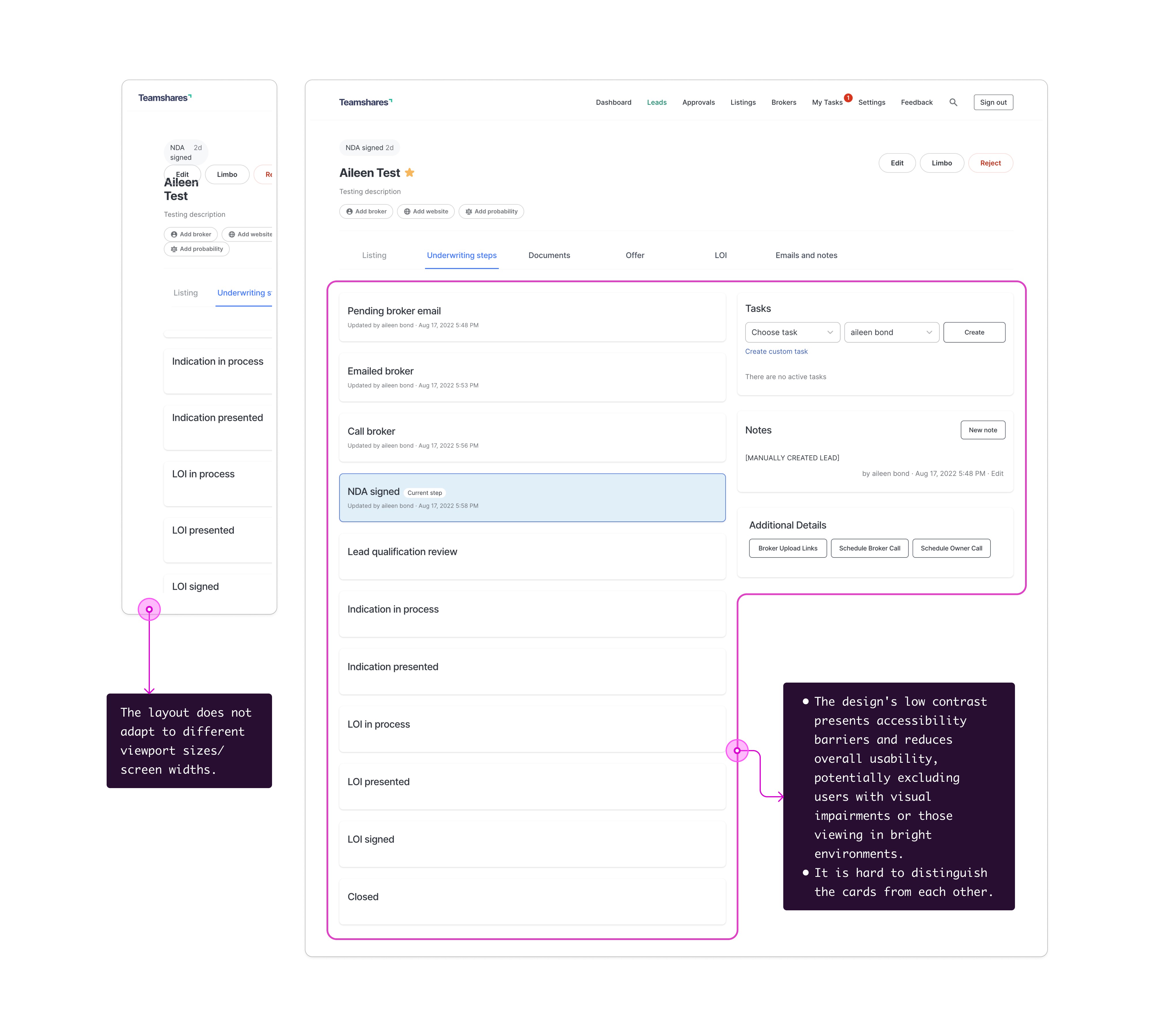
Information overload
Users reported feeling overwhelmed by the constant display of all underwriting steps
The interface presented too much information simultaneously, making it difficult for users to focus on their current task
Critical action items were getting lost in the visual noise
Poor progress tracking
Lack of clear visual indicators for task completion status
Users struggled to quickly determine which steps were finished vs. pending
No intuitive way to track overall progress through the underwriting process
Limited mobile accessibility
Non-responsive design forced users to rotate devices for proper viewing
Suboptimal mobile experience created friction for users working on-the-go
Interface elements weren't properly scaled for different screen sizes
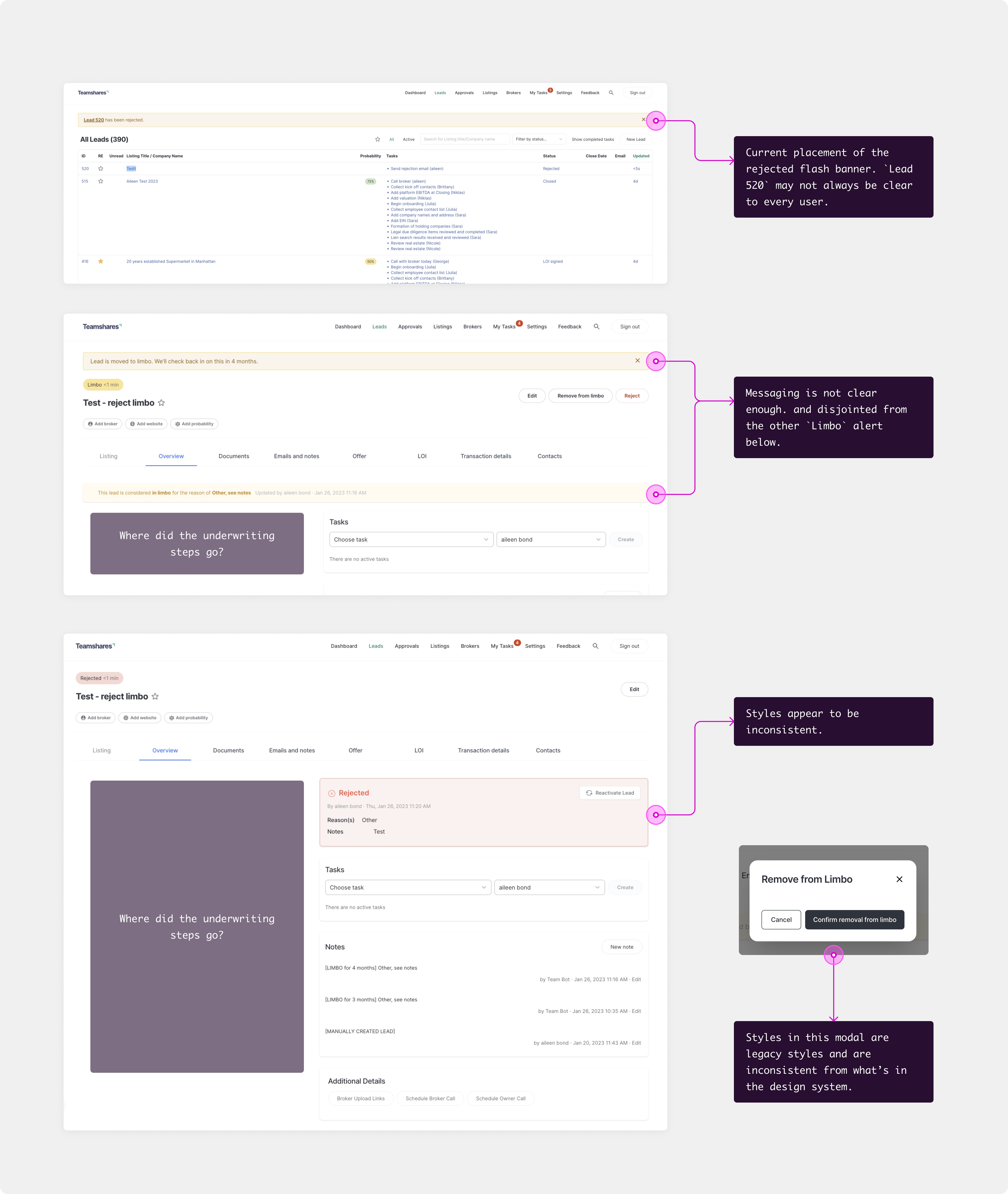
What it looked like before
Solution:
What began as an incremental improvement evolved into a transformative redesign, driven by consistent user research/testing and a willingness to challenge initial assumptions.
Initial approach:
Started with a conservative strategy focused on minimal technical changes and push out quickly
Planned to enhance the existing UI with micro-features for better progress tracking
Aimed to maintain familiar workflows while improving clarity
Let's challenge this:
User testing revealed a fundamental misalignment between our initial approach and user needs:
Users weren't just struggling with tracking progress—they were experiencing cognitive overload from seeing the entire process at once
The "always-visible" approach was actually hindering rather than helping
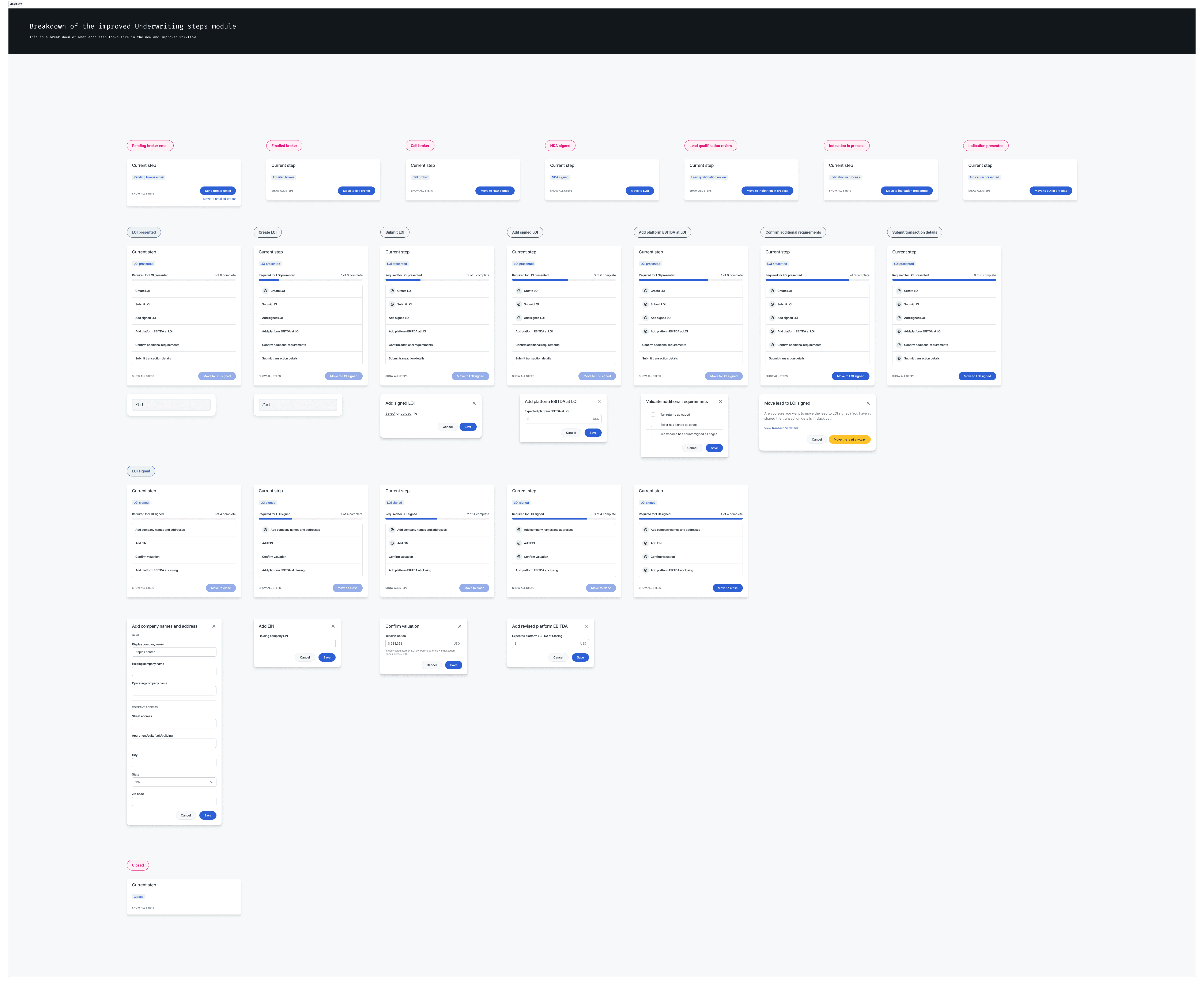
How I typically lay out the progression of the patterns to prototype and hand off to engineers.
Outcome
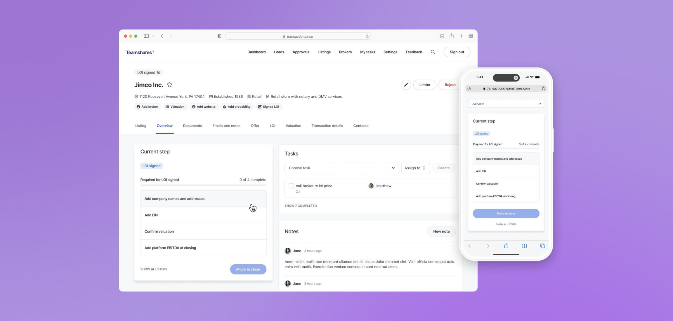
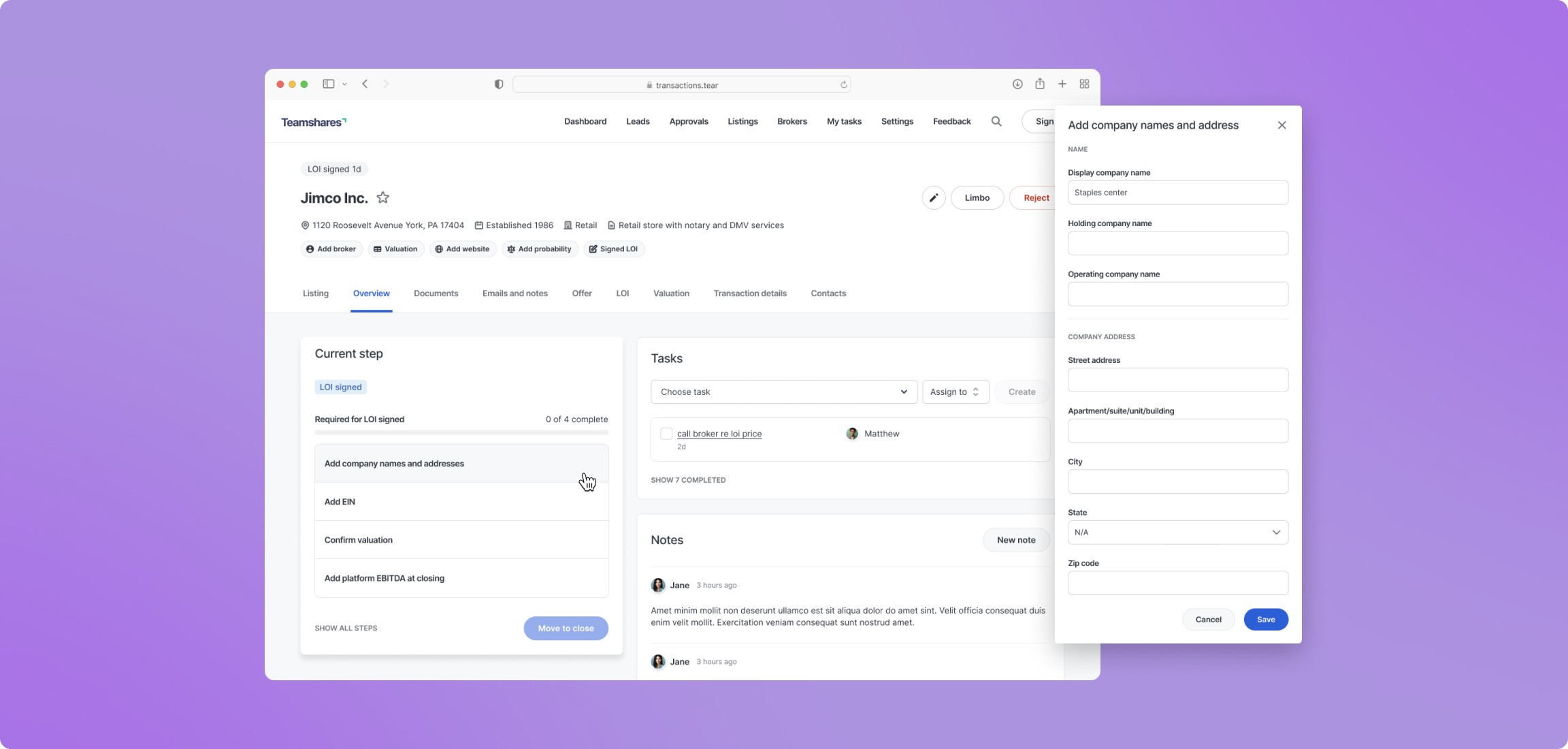
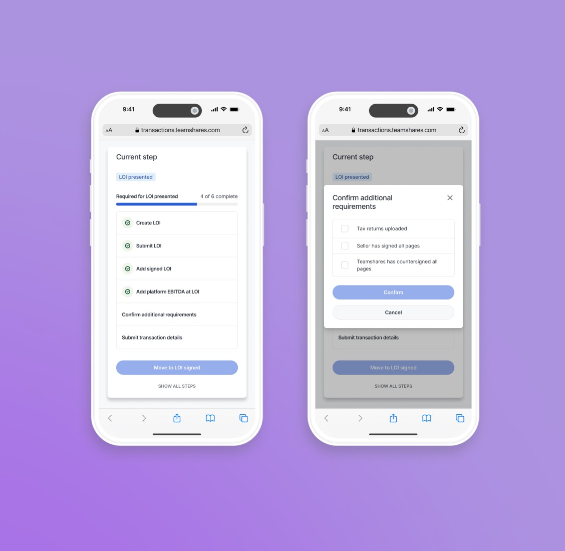
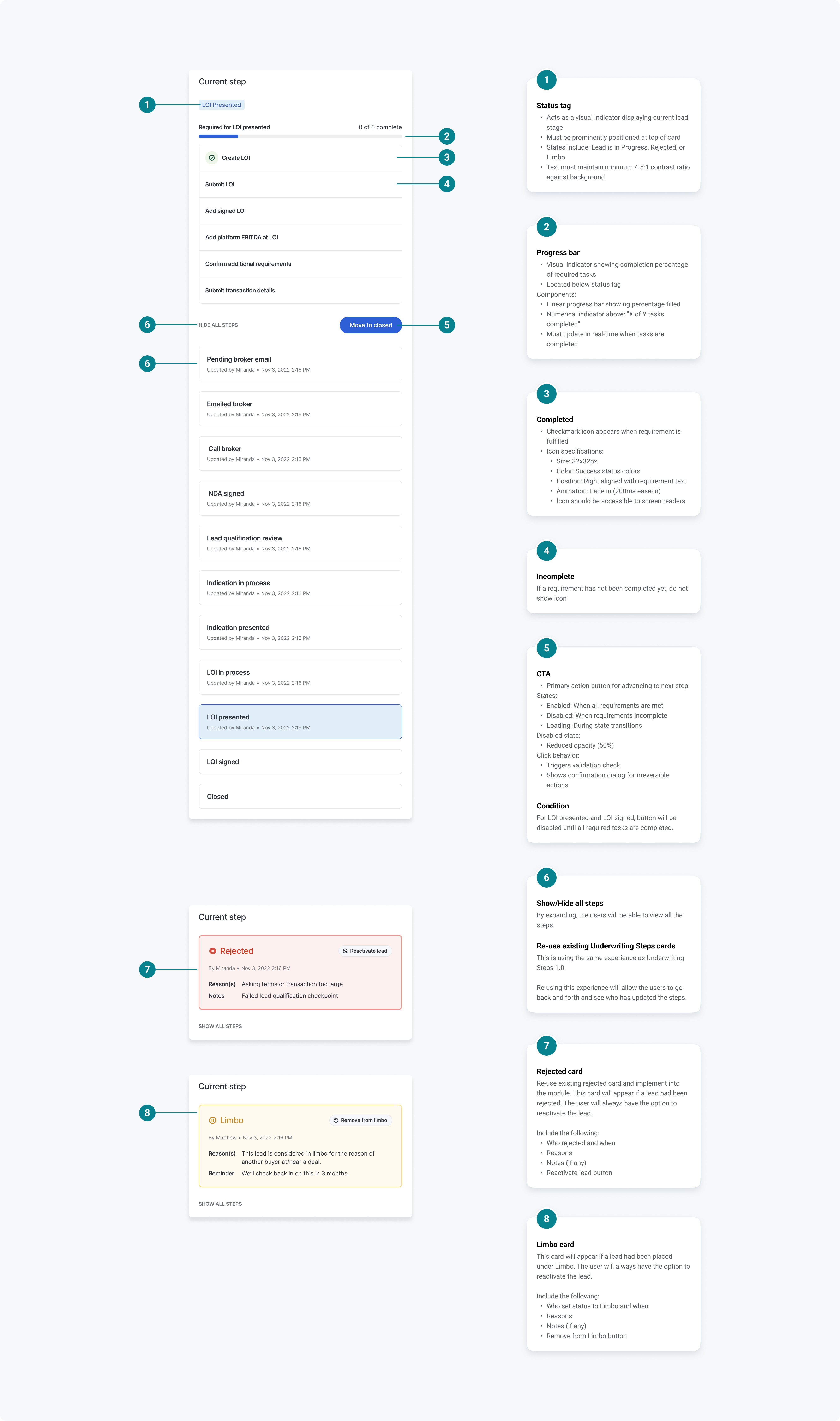
A more efficient system that helps Teamshares evaluate and transition more businesses to employee ownership. With this redesign, we were able to address all the pain points above. The design simplified the experience in focusing on current steps. It also improved progress tracking and completion status visibility. Last but not least, we have accommodated for a fully responsive experience.
The design improved scalability by consolidating all underwriting-related statuses and actions into a single, comprehensive card component. By integrating Limbo and Rejected statuses directly into the Underwriting Steps card.
Maintained context so that users do not have to switch between different sections
Improve usability through consistency by re-using common patterns, predictable location for status-related actions, and a unified experience whether a lead is active, rejected, or in limbo
Enabled easier future expansion by accommodating new future statuses and additional steps can be added within having to restructure
Accelerated decision-making:
Target: Reduced time from listing receipt to LOI issuance
Impact: 15% reduction in time to investment decision
Optimized resource allocation:
Target: Reduced manual intervention in broker introductions
Impact: ~20% reduction in broker intro calls through improved educational flow
Along the way, we were also able to make other stylistic improvements such as:
Added a gray background to display more contrast between the background and the cards
Cleaned up legacy buttons and fields and replaced them with updated components from the design system
